This is the 3rd iteration that was critiqued
After my critique, I was having trouble this the idea of unveiling the letter after or before the message that I, as the narrator, was trying to convey. The problem with my previous book was
a. The graphics were not aligned in aesthetic.
b. For the personal nature of the book, it was to weighty and clumsy.
c. The mashrabiyya was thick card stock and this did not give the female softness to it.
d. The transparent aspect of the mashrabiyya was not translating.
So to fix these issues I changed all the "hardstock" to a semi transparent paper.
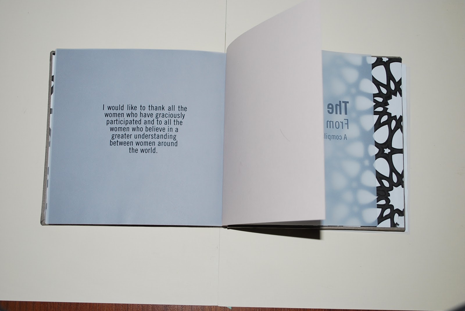
The graphics began to use the "unveiling effect" by using typography to unveil through the transparencies ( every time you flip a new page a new message arises. )
the soft color of the transparent paper worked to my advantage to make it less clumsy.
The graphics work with this transparent paper.
I have also switched the spine of the book so that it is on the right instead of the left, as it is in arabic.
as you can see the spine is on the right side.
some part of the mashrabiyya is cut out as you can see above
some of the words aren't showing through as clearly, so i was thinking maybe having a cut out square so that you can see it word more clearly.
This is an example of the glue looking horrible through with the transparent paper. I am going to have to use a different adhesive.
I am sew binding these edges and hope when i bind that i can have a pins go through the spine edge.
My next challenge is how am I going to bind this thing and make it professional looking. Also, I have not received all of my letters yet and a lot of the messages/ graphics rely on the letters, so i hope to receive more soon. I have begun to consider japanese slab stich and also perfect binding. As I am combining decorative paper and transparent paper, i dont know how i am going to print it so that I dont not have to paste one page to another.